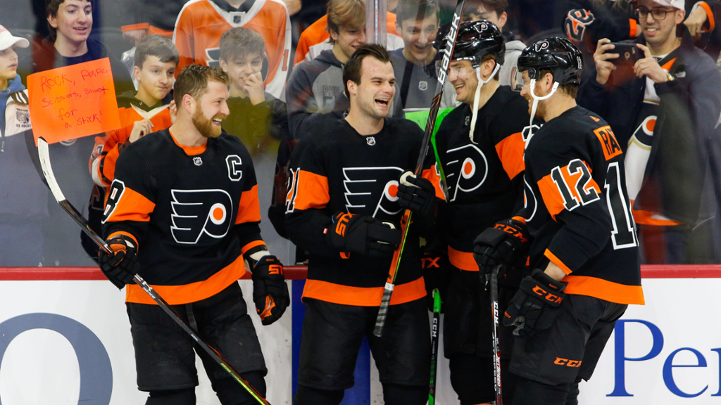
With the NHL releasing the Reverse Retro jerseys last season, the Flyers added yet another jersey to the storied history of this franchise. Throughout the years, the Flyers have always seemed to have success with jersey designs, but which jerseys have been the best?
Bonus: the Worst Flyers Jersey

Ok, not all the Flyers jerseys in history have been home runs, and this one was the worst out of all of them. The Flyers had the opportunity to make these jerseys memorable, and they did, but in the wrong way. The 50th Anniversary jerseys were just the normal Flyers away jerseys with gold numbers, gold letters, and a gold outline outside the logo. It did not look good anywhere, off-ice or on-ice. For a storied franchise, fumbling the 50th Anniversary jerseys was an unfortunate and unforgettable disaster.
5) 2017 Staduim Series

These jerseys are some of the best of the recent Flyers collection. From 2010 to 2017 the Flyers had been without a black jersey. For a team that’s nicknamed “the orange and the black” not having a black jersey, even at least as an alternate, seemed a bit odd. Now as the team’s primary alternate, this jersey is a fan favorite, and just all-around looks nice.
4) Reverse Retro

A nod to the old Eric Lindros era orange jerseys with a twist, these jerseys are a fan favorite after only one season. The burnt orange jersey was a nice change of pace from the neon orange jersey that many associate with the Flyers. The shoulder and sleeves blend well together too, making this an all-around beautiful jersey. Hopefully, they continue to wear this jersey this upcoming season.
3) Early 2000s Black

These jerseys were the peak of black jerseys in Flyers history. They not only looked great when on the ice, but they were around for many big moments in Flyers history. Many fans love these jerseys not only because of how beautiful they are, but also because of the memories that come along with them. The one most fans probably think of first is Simon Gagne’s game 6 OT goal against the Lightning in the 2004 ECF. Sadly, the era of the black jersey closed when the Flyers went back to their roots and brought back the orange home jersey in the 2010s.
2) Original Orange

The original orange jerseys are gorgeous for being such old jerseys. These jerseys are beautiful, especially the black captain’s letter. A classic jersey that has been the baseline for many of the orange jerseys that the Flyers have worn throughout the years. This jersey deserves to be this high because of the overall impact, it has had on all other Flyers jerseys, and also just because it looks great. Also, any jersey that has been seen with the Stanley Cup will always bring back great memories for the fans.
1) 2012 Winter Classic

These jerseys just look nice. The theme of the 2012 winter classic seemed to be creme as the Rangers’ primary jersey color was creme, and the Flyers incorporated creme beautifully into their jersey. The orange stands out, and the creme-colored stripes make the jersey smooth, while the black shoulders and stripes are the perfect amount of black. And of course, in the fine details, the Keystone patch where the Captain’s letters are and the strings just round out an all-around fantastic jersey. Sadly these have been cast aside after a few years as the alternate for the new black jerseys, but many fans hope one day these will return.


