The Flyers are entering a “New Era of Orange” which now includes a new sweater design.
In this era, they have already completely reworked the front office from top to bottom, started to move on from the previous group of core players, and today unveiled the new sweaters that will be worn for the foreseeable future.
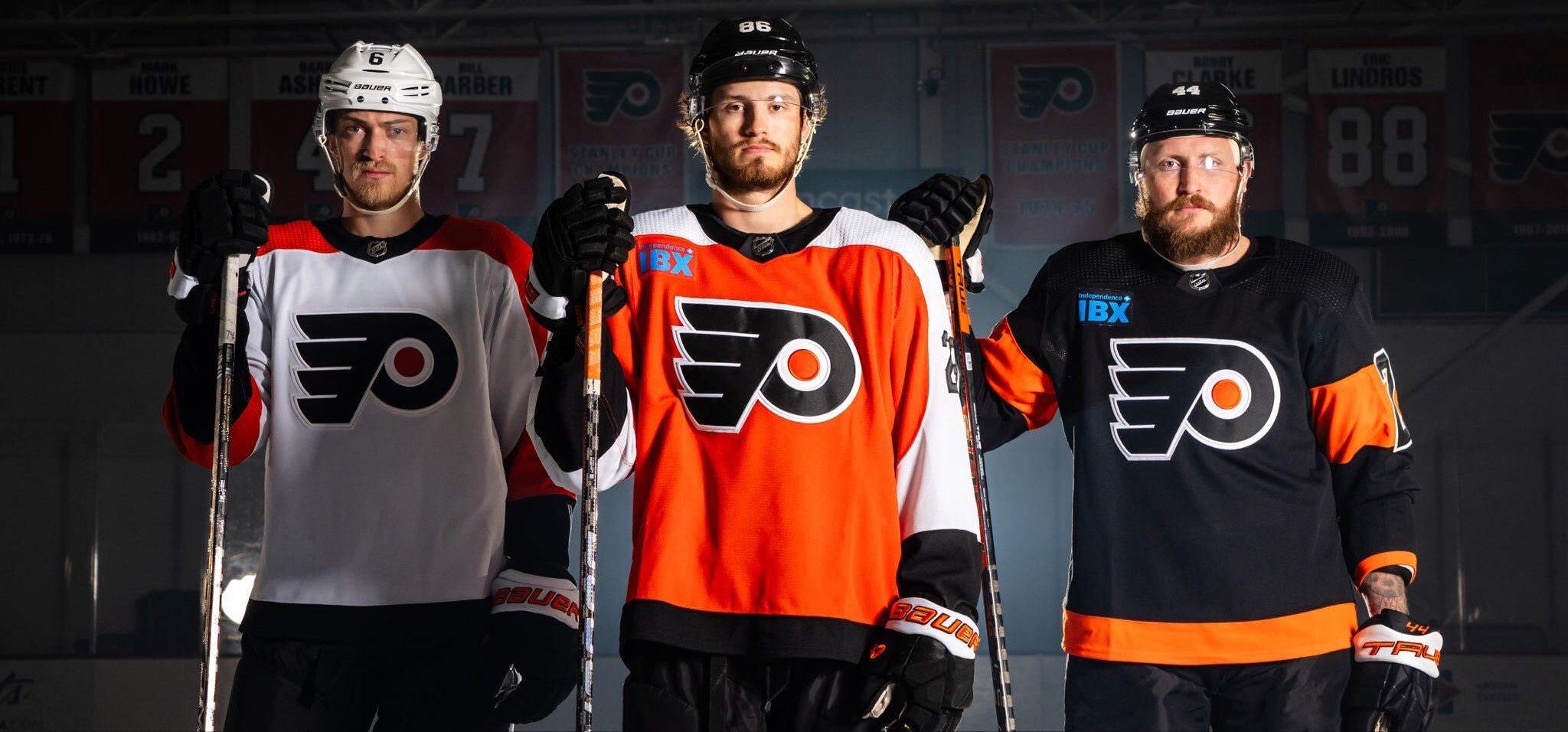
For a “New Era of Orange,” these sweaters are really just a remake of the old sweaters from the 1990’s.
The new sweaters are pretty simple. Both have solid base color with the inverse color from their shoulder down to the wrist. The wrist, the collar, and the bottom stripe are black on both. The sweaters are the exact same design just flip-flopping the orange and white on the sleeves and the body.
The numbers are also different on the sleeves for the home sweater, going from orange to black. The sleeve numbers on the away sweaters stay white. The numbers on the back stay the same as well, white with black outline on the home and orange with black outline on the road.
The Flyers’ 3rd black alternate is here to stay, and interestingly enough, the old color of orange seems to still be used on the black sweater. Maybe the idea is that it makes it more “retro” now as we are officially out of the neon orange era of Flyers hockey.
The pants for all three uniforms will be black, so that still hasn’t changed.
It also seems that the Flyers will be playing with an advertisement on their sweater this upcoming season after playing without one the previous season. Independence Blue Cross will be the sponsor this season, and at first glance…the blue does NOT match the sweaters whatsoever.
The Flyers continue their time honored tradition of being as boring as possible with little to no flair when it comes to uniform design. These sweaters are just a worse version of the previous burnt orange era sweaters. They’re just a base color, a sleeve color, and a wrist color. The numbers on the sleeves are solid colors with no outline and do not mesh well with the sleeves, looking boring, blocky, and uninspired. There are no stripes except a solid black bar that will just blend in with the pants.
There’s no second logo, meaning yet another season where the Flyers are one of the only teams in all professional sports without an alternate logo giving them limited flexibility in the future for new designs. There aren’t any sweater strings around the collar that could’ve added at least SOMETHING interesting. And there’s no new creative design, just a recycled design to create nostalgia in the fanbase.
With the blowback the Flyers got from their Reverse Retros from a majority of the fanbase for how boring they were, seeing how similar the new sweaters are to them just seems lazy, boring, and deserving of the same criticism. However, the criticism probably won’t be there, as these designs and colors remind fans of the good times in the history of the Flyers.
As always the true test is seeing them on the ice in action, but for now people will feel a sense of nostalgia and hope with these New-Old sweaters.
2024 Stadium Series Trip
Flyers Nation and Philly Sports Trips have teamed up to bring you on an amazing bus trip to the 2024 NHL Stadium Series between the Flyers and Devils. Place an early deposit to reserve your spot at the ultimate tailgate experience at MetLife Stadium before the game. The package includes a game ticket, round-trip charter bus, an all-inclusive tailgate party with unlimited cold beverages, “Philly Style” catered food, live entertainment, and more.