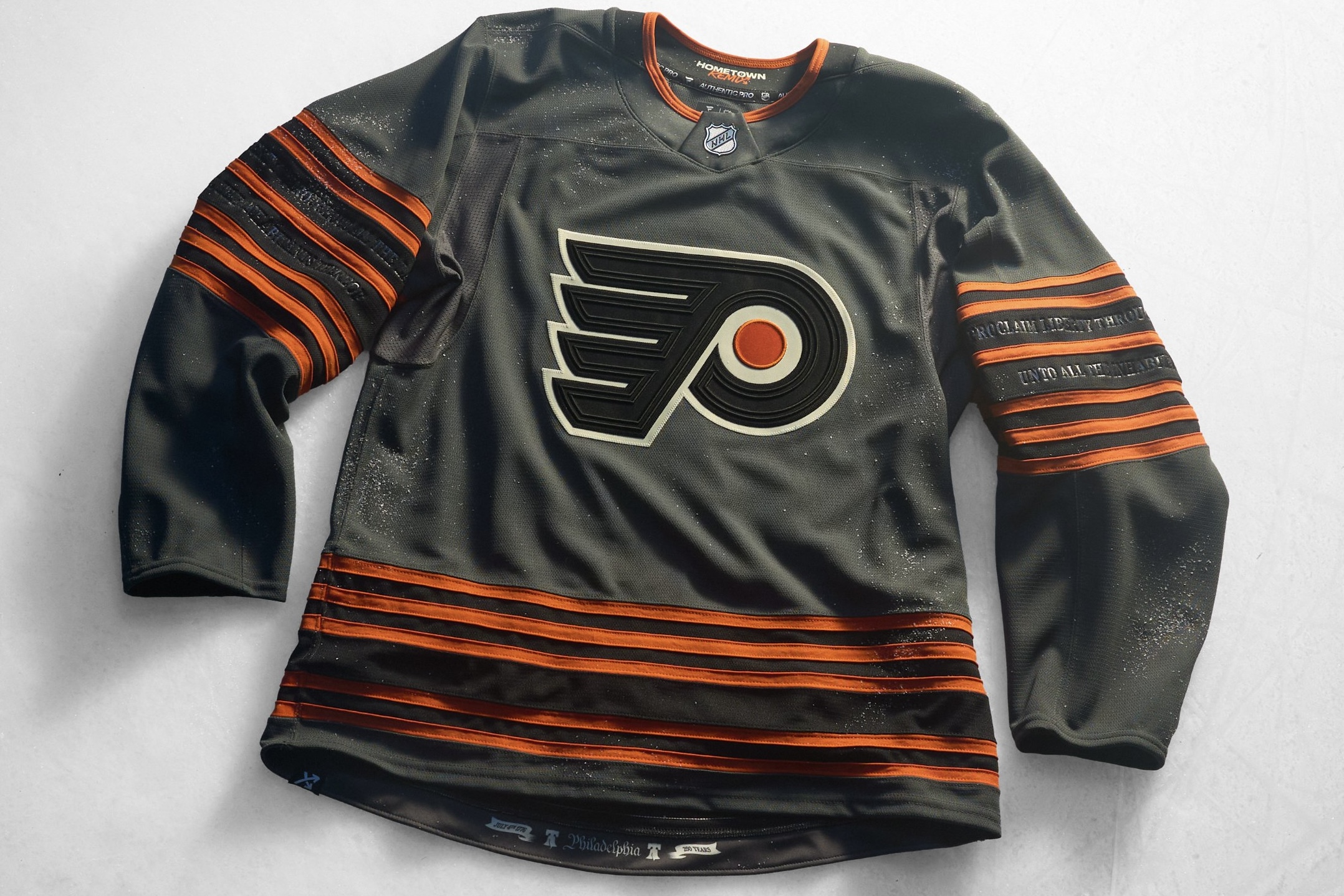
Well, after months of leaks, teases, and fan mockups based on word of mouth alone, the Philadelphia Flyers, along with the rest of the NHL, have released their 2026-2027 Hometown Remix jerseys.
Well… they’re definitely different from other Flyers jerseys in the past that’s for sure. Let’s take a deeper dive into these new releases and go over the good, the bad, and the very, VERY ugly.
GOOD: It’s finally a different color
After years of only using black, orange, and white, the Flyers FINALLY go a new route and use a fourth color as the base for a jersey. Yes, they have used gray/silver in the chrome 3D logo, gold for those atrocious 50th anniversary jerseys, and cream in their 2012 Winter Classic jerseys before as accent colors, but the base of the jersey has always been black, orange, or white.
BAD: The color is gray…
Gray isn’t a bad color to incorporate into jerseys. It’s a great neutral color to add in as an accent color. The problem is that unless we’re talking about MLB, gray jerseys just do not work in sports. It hasn’t worked with the Bills this year in the NFL, and didn’t work in the past with the Sixers in the NBA, and even the grey jerseys during the Reverse Retro jersey era in the NHL were bad, specifically the Sharks and Jets.
UGLY: They’re gray!
Out of all the colors the team could’ve gone with, they went with gray. If this was a black jersey with grey and orange accents, or even an “old document cream” colored jersey with black and orange accents I think it would’ve immediately been an all time hit.
GOOD: The Numbers and Font
Okay, okay, I think it’s cool that for the first time in Flyers history the Flyers are using orange numbers on a non-white base, and I don’t hate the cracked numbers idea. I just think it still would’ve worked better on Black especially after the last black jersey had black numbers. The font is also different but good too. It looks like old writing and is done way better than how the Phillies did their old writing for the City Connects. See you don’t need to be the same blah for 50+ years. It’s ok to branch out and live a little creatively.
BAD: Liberty Bell logo is on the back of the helmet as a sticker…
https://twitter.com/NHLFlyers/status/2117346273414025511
The Liberty Bell logo the team had been teasing for months is just a sticker on the back of the helmet that got a tiny one second shot in one of the promotional videos. It’s not a shoulder patch, it’s not on the pants, and it wasn’t the main logo – it’s on the back of the helmet as a small sticker. They teased this logo during the draft, during Gritty’s promotional video for theme nights, and had it as a logo on the commercials the Flyers have running for the first Hometown Remix night. The Flyers have had the same logo their entire existence, only changing the colors slightly. Teasing a big change (one the fanbase actually seemed to like!) just to not have it anywhere on the jersey is really dumb.
UGLY: Like… really? They’re gray?
Seriously, is this a bit? Are we being pranked? Has Comcast just phoned it in to save money by using a color that is know to be cheaper to produce than white or colored items? Gray is not a color I think many fans think would make sense for a Flyers jersey.
GOOD: The tiny details
Alright the details on this are sick. The textured logo is nice. As said before the cracked numbers are a cool concept. The Liberty Bell inscription on the sleeves is quirky but done well, and the 250 year mark on the inside of the bottom is cool. They put a lot of effort into the tiny things that leaks would not pick up on, kudos.
BAD: How long it took for them to come out
I feel like the hype around this idea has been dead for so long. This is just a “oh, they finally came out” feeling more than anything. The NHL should really make a whole announcement for new jerseys the day before the regular season to get everyone excited for both the jerseys and opening night, but their marketing department apparently does not think the same as me or many of the other hockey fans.
UGLY: Did I mention they are GRAY????
I know the Flyers were going for a Liberty Bell thing, but the Liberty Bell is bronze.
Look, the design itself is GREAT. The Flyers finally got a little bit creative and added pizzaz to the jersey with the textured logo, the cracked numbers, and even the font they used is different and unique. They stepped out of their comfort zone for the first time in years and made some super fun changes. Unfortunately they seemed to be TOO excited to be outside of their comfort zone that they went rouge and made the base of the jersey grey when they did not need to.
Overall, the jersey isn’t bad. There are a LOT worse ones that were released. So while yes, the Flyers did not have a bad jersey compared to others across the league, in a vacuum this jersey is exactly like the color gray itself: Mid.
FLYERS ALUMNI VEGAS AND IRELAND TRIPS
Flyers Nation and TrueFan Travel have teamed up for two trips with the Flyers Alumni!
The Las Vegas package (March 10–14) includes tickets to Flyers–Golden Knights on March 11 at T-Mobile Arena, an all-inclusive tailgate, optional flights from Philadelphia, a 4-night downtown hotel stay, an alumni pep rally and Q&A, a Flyers vs. Utah watch party, and a meet and greet.
The Ireland Golf & Tour Experience (July 20–27) includes optional flights from Philadelphia, six nights at The Brehon Killarney and Portmarnock Resort, a welcome reception, a meet and greet and Q&A with Brad Marsh, Patrick Sharp, Joe Watson, Bill Clement, Mark Recchi, and John LeClair, a live Coatesy’s Corner, and optional golf at Old Head, Dooks, Portmarnock, and Druids Glen.
Whether you’re chasing a road game in Vegas or a week on the links in Ireland, these are two chances to travel with Flyers legends!




You must be logged in to post a comment Login