After months of speculation, mock-ups, and fake “leaks” the Philadelphia Flyers have released their new alternate jersey. This jersey is to be worn in the 2024 Stadium Series game against the New Jersey Devils. This will be the Flyers third Stadium Series jersey in the past eight years.
T̶e̶n̶t̶h̶ ̶A̶v̶e̶n̶u̶e̶ Turnpike Freeze Out.#StadiumSeries | #LetsGoFlyers pic.twitter.com/Yr05dVwHoG
— Philadelphia Flyers (@NHLFlyers) January 26, 2024
With this jersey release, the Flyers add yet another white jersey to their alternate collection, all while continue the tradition of bland and boring.
The Good
Don’t get me wrong, the jersey is pretty cool for a white jersey. There’s a lot to like about these.
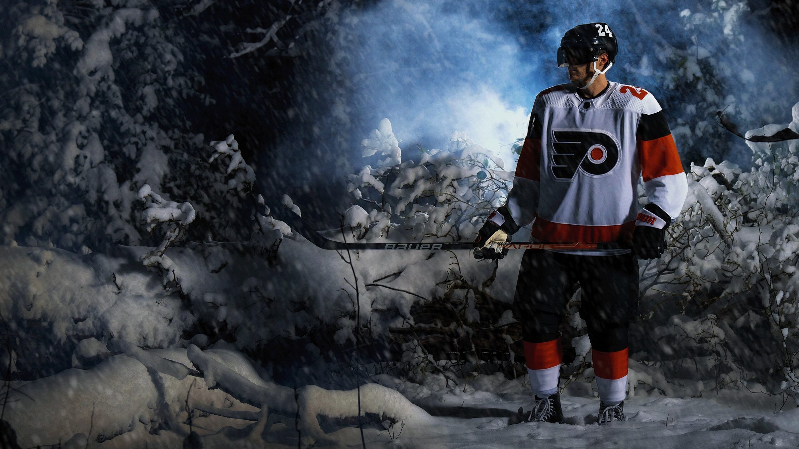
First of all, the sleeves have all three Flyers colors, black, orange, and white, but not in a way that looks bad or overwhelming. I also like the order in how it went, the orange in-between the black and the white break up the opposite spectrum colors, it just progresses light to dark. Very nice.

(Courtesy of the Philadelphia Flyers)
Second, the use of the colors is great. The nameplate on the back is still there, a Flyers jersey calling card, but this time there’s a tweak. The Flyers now have the black nameplate blending into the black on the sleeves; it looks really sharp. The bottom stripe on the jersey is nice too. I’m glad it’s orange and not black, too much white and black wouldn’t make it feel like a Flyers jersey. Making the numbers orange was a great choice as well. The orange is needed.
Third, the numbers are giant on the back and the shoulders, which I really like. They’re not comically large, but not too small like a lot of the numbers on jerseys these days. The numbers being on the top of the shoulder instead of the sleeves is great too. Having the Stadium Series patch on the sleeve and not the front is great as well, it makes the front way less crowded.
And finally, the Flyers logo on the front. The Flyers’ “Flying P” is the only image or lettering that has ever been on the front of the sweater, and probably the only image or lettering that ever will be.
The Ugly
As much as there’s good, there’s also ugly.
First let’s address the most egregious mess with this uniform, what the actual hell are these helmets? The giant logo on one side and the giant number on the other side looks bad. Either have the number in the front or back and have the logo on either side like NFL teams do with their helmets. It just doesn’t look good with the way it is right now.
Second is the same problem that the Flyers have with the jerseys they’re wearing this year: where is the piping? There’s no black piping around the numbers. The numbers look like they were ironed on, both on the back and shoulders. It doesn’t look good. Just a black outline of the numbers would look so so SO much better. Apparently this is part of their new future jersey designs, and it STINKS!

(Courtesy of the Philadelphia Flyers)
Finally, the black pants. I would’ve LOVED for the whole set to be primary white. Having the black pants just doesn’t feel right. I know the Flyers don’t wear any color pants besides black, but this was the one time they could’ve gotten super creative and gone full whiteout. The pants could’ve had orange and black stripes down the sides of each leg to break it up. I don’t know, I feel like each time the Flyers design a jersey, they put a jersey together and just neglect the pants (except the Cooperalls, they should’ve worn those in a game).
The Bad
This section isn’t about the jersey. It’s about the design team.
The Flyers, for YEARS, have had jerseys that have been as boring as possible with little to no flair when it comes to the uniform design. There’s no second logo, meaning yet another jersey where the Flyers use the “Flying P”. I know it’s iconic, and I LOVE the logo, it’s just that it gives them limited flexibility in what they can do both now and in the future for new designs. It gets to the point where it feels like the same jersey is being created with minor tweaks to say “Look! It’s different! How cool is that!?!” In reality, not much is different. They need to get new ideas.
On top of this, the Flyers have yet ANOTHER white alternate jersey. With the blowback the Flyers got from their Reverse Retro 2.0 jerseys last year from a majority of the fanbase for how boring they were, creating yet another white sweater with little to no pizzaz just seems lazy, boring, and deserving of the same criticism. Alternate jerseys are supposed to be exciting. This one just feels like a normal away jersey, which isn’t what it should be.
Overall Grade: B-
Don’t get me wrong, in a vacuum these jerseys are very, very nice. I think if this design was the Flyers’ home and away design this season with an orange and a white set, I’d really really love them.
Yes, there are some minor problems with the numbers being bad and the helmet design being a mess, which ding them a little bit. What really dings them, however, is the idea that they can release a white jersey with minor changes and expect the fanbase to really love them. It takes creativity to make a white jersey pop, and with the Flyers’ history of NOT being super creative (except one chrome logo in the early 2000s) it just feels recycled at this point.
As always, we won’t truly know how these will look until the day of when they’re worn on the ice, but as of right now there’s little to really get excited about.
2024 Stadium Series Trip
Flyers Nation and Philly Sports Trips have teamed up to bring you on an amazing bus trip to the 2024 NHL Stadium Series between the Flyers and Devils. Place an early deposit to reserve your spot at the ultimate tailgate experience at MetLife Stadium before the game. The package includes a game ticket, round-trip charter bus, an all-inclusive tailgate party with unlimited cold beverages, “Philly Style” catered food, live entertainment, and more.


Flyers News
Ducks Match Flyers Offer Sheet for Leo Carlsson


Flyers News
Flyers trade Garnet Hathaway to Florida Panthers


Flyers News
Flyers Make Dan Vladař Extension Official

Flyers News
Flyers Issue Qualifying Offers to Four Players


